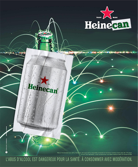


Heinecan
Insight
While beer brands have long celebrated the bottle as the iconic format, the can has quietly become the smarter, more practical choice but yet remains underestimated.
Big Idea
Turn the can into the new icon of Heineken by giving it a name of its own: Heinecan.
Concept
A bold rebrand where the can is no longer just a format, but a statement.
By subtly transforming “Heineken” into “Heinecan”, the campaign reframes perception and making the can the hero of the brand.
Execution
Heineken revisits its most iconic campaigns by replacing the bottle with the can across print, outdoor and social.
The identity evolves for the occasion, with a redesigned can and adapted visual system, creating a seamless shift from product to symbol.
From packaging to digital platforms, the campaign blurs the line between branding and communication.
Role
Art direction, concept development, visual design.